
A stock-market heatmap can tell you what is moving in seconds. It cannot, on its own, tell you what is cheap or what will rise next. Understanding that difference makes the map much more useful.
Turn the map into a repeatable research process: read the legend, measure breadth, then check the business behind the color. The example numbers here are invented for teaching; they are not today's market data.
Start with the map's three controls
First identify the universe: the S&P 500, all listed stocks, an exchange, or a sector. Then identify what tile size represents, commonly market capitalization. Finally read the color legend and time window. A daily price change, a one-year return, a dividend yield and a price-to-earnings ratio answer different questions.
You can explore these controls on the Finviz stock map. Interface options can change, so use the legend visible on the map rather than relying on an old screenshot. On a phone, opening the map separately can be easier than trying to read a dense embedded image.
| Map setting | What it helps you see | What it does not establish |
|---|---|---|
| One-day performance | Today's winners and losers | Long-term value |
| Longer-period performance | Relative recent strength | A future return forecast |
| P/E ratio | Price relative to an earnings measure | Earnings quality or durability |
| Dividend yield | A yield measure at the displayed price | A guaranteed payment |
A green index can hide weak breadth
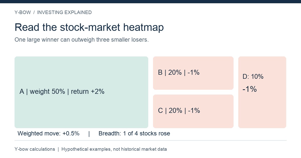
Imagine four stocks weighted 50%, 20%, 20% and 10%. The largest rises 2%; the other three each fall 1%. The approximate weighted index move is +0.5%: 50% × 2% plus 50% × −1%. Yet only one of four stocks rose.
This is why a large green rectangle can dominate a map while most tiles are red. The map is showing size and performance together. Counting green tiles measures something closer to breadth; adding weighted returns measures the index result. Neither replaces the other.
The S&P 500 uses float-adjusted market-cap weighting, while other indices may use different approaches. S&P Dow Jones Indices: S&P 500. Our example is a simplified weighted portfolio, not a reconstruction of the index's live calculation.
Low P/E does not automatically mean cheap
Suppose a stock costs $100 and earned $10 per share over the last year. Its trailing P/E is 10. If those earnings fall to $4, the same stock price corresponds to a P/E of 25 on the new earnings. A seemingly inexpensive tile may be reflecting a market expectation of declining profits.
Conversely, a high P/E may reflect strong expected growth—or excessive optimism. The map cannot decide which. Check whether the displayed ratio is trailing or forward-looking, whether earnings are positive, and whether one-off gains inflated the denominator. Compare companies with similar business economics rather than declaring every low-ratio tile a bargain.
Dividend colors need another check
A higher yield can arise because a share price fell, even if the dividend did not increase. If a $4 annual dividend is divided by a $100 price, the yield is 4%. At $50, the same payment would imply 8%. But a financially stressed company might cut the payment instead.
Before relying on the yield, inspect the distribution definition, payment history and cash generation. A recent quarterly payment multiplied by four is not the same as the last four actual payments. Do not compare labels that use different formulas as though they were interchangeable.
A five-minute routine that leads to better questions
Use the map to identify a pattern, not to produce an automatic buy list. Save the date, universe and metric. Compare the index direction with the number of rising and falling stocks. Look for sectors moving together. Then open the company's earnings release or the ETF's holdings page to test the explanation.
For example, if energy shares rise while utilities fall, ask what happened to commodity prices, financing conditions and company earnings. Do not assume that one macroeconomic variable explains every tile. A map is an efficient starting point because it tells you where to investigate.
Further reading
Browse our English investing articles for index construction and portfolio overlap. The Japanese heatmap guide covers the original discussion.
Reviewed October 14, 2026. Numerical examples and diagrams: Y-bow. No third-party market screenshot or live quotation is reproduced here.
Continue with Stock Charts: Linear vs Log Scale, and What Neither Can Prove and The Buffett Indicator: A Valuation Lens, Not a Market Timer.






Comments